


When it comes to color and ecommerce, nothing’s ever black and white.
For so many people visuals matter the most, and your customers are the same. They might not consciously notice the color scheme of your store or catch the exact red hue of the call-to-action button you’ve spent weeks choosing, but their subconscious is hard at work all the time. And there, the color takes the cake.
Customers want only 90 seconds to take a snap judgment about you and your product. This is true for online shopping especially because customers can’t utilize their other senses to make a decision. In addition, up to 90% of this judgment is dependent on color alone.
The human eye can see about 10 million unique colors, so picking a color scheme for your business can seem to be a mission impossible. It doesn’t help that colors are basically just a pigment of our imagination – each person sees colors a little differently. No wonder that the white/gold vs blue/black dressgate got 4.4 million tweets in just 24 hours.
But don’t worry – there’s a science behind it all that just might help! And that’s why we’re gonna look at color theory, color psychology, and how they can help you get the best out of your ecommerce business.
Color theory
Let’s begin with the basics, which for this situation means color theory. Basically, it’s the science and art of colors that looks at how we perceive, mix, and apply them. Color theory strives to create a logical structure for using color, and it all begins with the oh-so-familiar color wheel.
Color Wheel
The color wheel is a visually simplest way to understand the connection between colors. The traditional color wheel, most often seen on the walls of high school art classes all over the world, offers 12 colors.
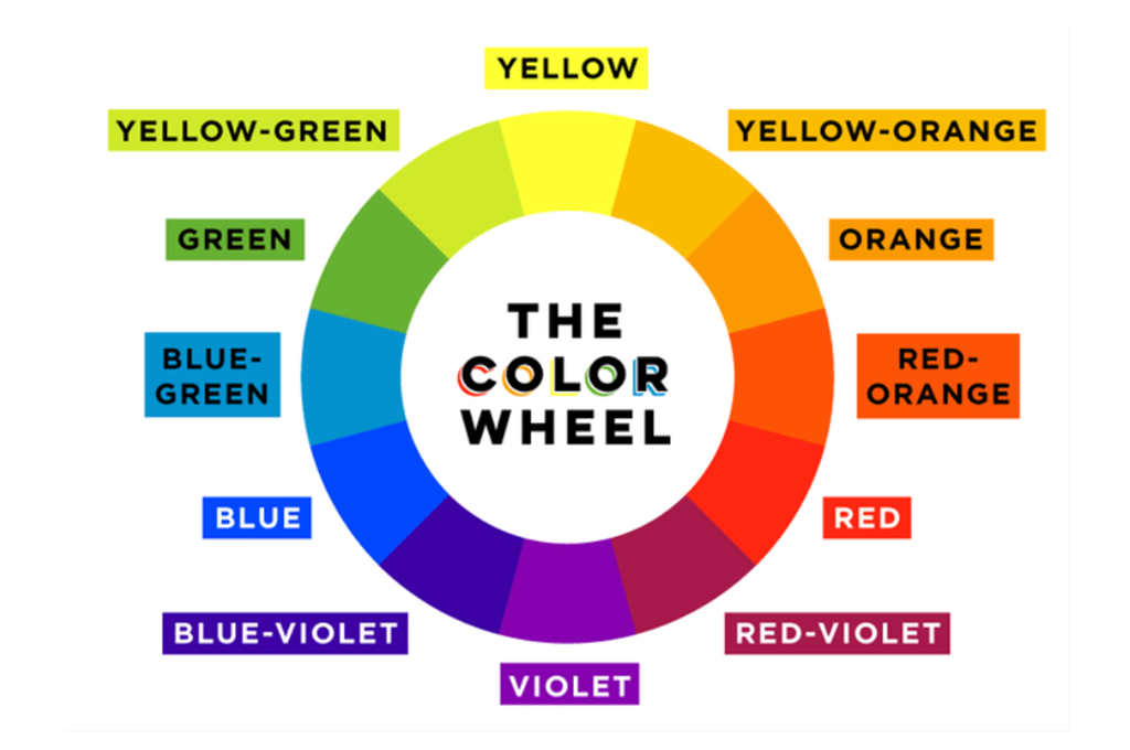
The primary colors in the wheel are red, yellow and blue, and these can be used to create secondary colors (orange, green, violet). By mixing primary and secondary colors we get tertiary colors – red-orange, yellow-orange, yellow-green, blue-green, blue-violet, and red-violet.
So far, so good, and it might have stayed that way if these were the only colors we had to deal with.
Color Psychology
Keep in mind that color psychology isn’t an exact science. It relies upon a person’s culture and the context with which the color is exhibited. For instance, Western culture sometimes associates yellow with cowardice while Japanese culture associates yellow with courage.
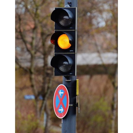
Context likewise plays a significant role in how color influences us. For instance, we also use yellow in stoplights and warning signs to indicate a need for caution.
When HubSpot did A/B tests with two different call-to-action buttons, they found out that the red button outperformed the green one by a whopping 21%. One of the possible clarifications for this is that green relaxes while red excites people. Each color has certain attributes that are linked to them, and the psychology of color in marketing tries to figure out how to use them effectively. Here are absolutely the most popular associations:
-
Blue – peace, tranquility, security
- Blue is a well-known color among financial institutions as it can define trust. The importance of blue varies more extraordinarily dependent on shade and hue than other colors. For instance, a darker blue may bring out more feelings of security while a lighter blue feels a lot friendlier.
-
Purple – royalty, wisdom, respect
- Purple is truly associated with royalty. Purple dye was more costly in ancient times and only the wealthy could bear the cost of it, leading to purple being known as a royal, elegant color.
-
Orange – excitement, friendliness, cheapness
- Orange fits pleasantly between red and yellow on the emotional spectrum. Orange is stronger than yellow however friendlier than red. Orange brings out positive excitement. Yet it is likewise often associated with autumn, particularly when combined with browns and reds.
-
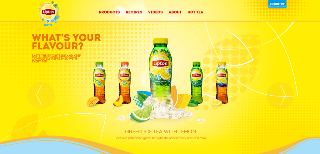
Yellow – sun, openness, activity
- Yellow can be an extremely cheerful color. It can likewise be associated with alert and cowardice. Bright yellow can strain the eye.
- Check out the Lipton Ice Tea website and see how this works in action.
-
- They have gone all yellow with certain accents in blue and red. The yellow color is related to sun, openness, and activity. And wouldn’t you be able to simply imagine sipping some flavorful cold ice tea with lemon in a park on a hot summer day?
-
Black – power, stability, intelligence
- The importance of black changes greatly based on what other colors it is utilized with. All alone, black has solid ties to prestige and elegance. Consider credit card companies that offer “black cards” as their most renowned credit card.

-
Red – Energy, urgency, love, Excitement, passion, violence, aggression, anger, strength
- Red is a great example of context being important. Two conflicting feelings “Anger” and “Love” both are connected to red. Considering red in the context of Valentine’s Day makes you associate red with love. Thinking of red with regards to bullfighting makes you associate red with anger.
-
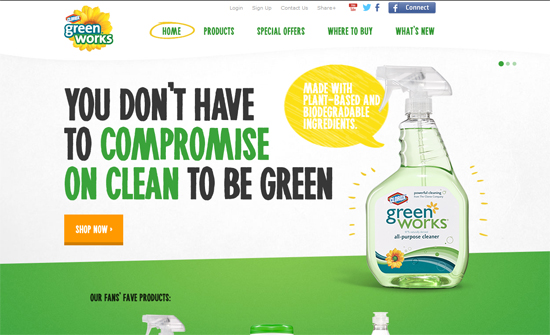
Green – Natural energy, fertility wealth, life, growth, Nature, environment
- Green is firmly tied to the environment and nature. Green is a well-known color with any business focused on environmental living and sustainability. Green can likewise be associated with riches, frequently with mint greens.
-
White – Purity, innocence, cleanliness, efficiency
- White has a solid connection with innocence and purity in Western culture and is traditionally utilized in weddings. But remember that color is firmly tied with culture. Japanese culture generally reserves white for funerals.
Know your audience
Just like in any other marketing strategy, first you need to take a look at your product and to whom you’re selling, and the color is a significant component of your brand personality.
It’s been proven that shoppers consider whether your product fits the branding – the colors you choose have to speak to what you’re selling.
Final Thoughts
Consciously and reliably using color psychology can lead to increased sales and more grounded brand identity. The first place where you ought to consider color psychology is your website. What message may you send depends on the colors you use on your site? How could color psychology apply to call-to-action buttons, significant text, or key pieces of the site increase customer engagement? Next, think about your brand in general. Do you reliably use the same colors throughout your marketing material?
Color has been shown to have as much as an 80% increase in brand recognition. Think about brands like Twitter, Google+, and Facebook. Each has a unique color associated with its brand and you could probably even recognize each company based only on its color.
You can also easily customize your online store with Builderfly’s theme customization section. Choose from thousands of ready-made templates, play around colors and sell your product to your online customers. Start your 14-days free trial today!