


According to Statista, the number of online sales constantly grows which means more and more people prefer shopping online. The retail field strives to offer its customers the best deals to be number one on the market. Today ecommerce mobile apps are a top solution, helping to simply get in touch with shoppers and increase sale.
The profit of ecommerce websites and apps depends on design decisions more than many other products. Successful ecommerce mobile app design increases chances to drive users because of the smart user experience and beautiful visual performance. If it is designed in the right way, consumers can easily shop items, no matter where they are. A time and effort-saving ecommerce apps will absolutely be becoming a favorite tool for so many people.
So, if you want to create a mobile app design for ecommerce, you must be wondering where to start and how to make it right.
First, you need to consider that there are two basic mobile platforms — iOS and Android. Designing an ecommerce mobile app from scratch, you have to choose which platform you’ll begin with. The choice depends on several factors including budget, time, and target audience. For example, if you need to create an app in a short time, you better start with iOS. Or, if you want to cover different devices, Android suits better.
Design practices for iOS and Android apps differ. There are strict guidelines that designers need to follow. Moreover, the design direction also often depends on the chosen platform.
Before you start coding, make sure to carefully prototype the UX design for your next ecommerce app. Here are a couple of things to remember.
Make on-boarding as simple as one-two-three
Mobile app on-boarding is an important thing in that it can either make or break the user’s expectations. So make sure to take good care of the on-boarding to engage users, not to freak them out. Keep the design simple and neat, you don’t need too many on-boarding screens, either.
Stradivarius has done it quite well. First, you see a list of countries which offer an online store and then a list of those which don’t. Then as soon as you choose your country, you are given the chance to choose either your language or English. Afterward, you reach on a 5-screen tour which portrays the mobile app and some of its amazing features in brief texts and with very wonderful lifestyle images in the background. Note that you can skip the tour any moment you want by simply tapping on that little cross sign at the right side of the screen.
Allow zooming images
Many times, users on mobile devices attempt to double tap and pinch to zoom product images. With this in mind, allow zooming the images. Most importantly, tell your shoppers that you support zoom gestures. For instance, Amazon enables zooming however you can have no idea about it until you tap on the picture and then pinch it. See the screenshots below:
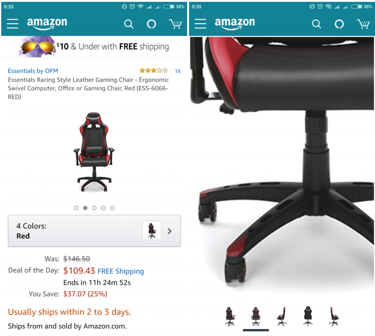
While the user can get the overall idea of a product from a larger image, they might want to inspect it more carefully. So, make sure you provide them with this opportunity.
Do not use auto-correct during checkout
Optimizing the keyboard based on the users’ needs is such a good idea. You can go beyond the above tip by disabling the “auto-correct” which appears on the touch keyboard. You know why? Because often it works poorly for abbreviations, email addresses, street names and stuff like that. And the users have to interrupt the checkout process just to retype the right words. This takes time and can be nerve-racking. So make sure to take care of this, too.
Avoid signups and checkouts that take too long
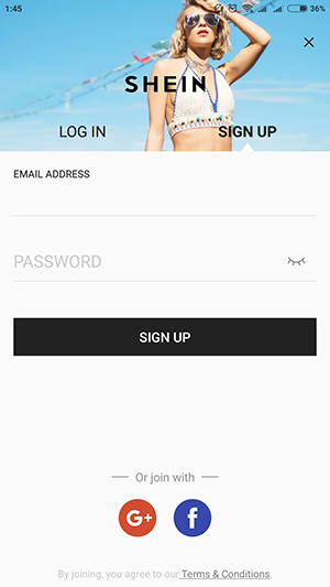
There is no user in the world who loves long signups and checkouts. Make the process simple, attractive, and most significantly short! Mobile app users don’t have the patience and the nerves to stand long processes. Want to make the process easier? Allow joining you through their favorite social networks. For example, SheIn allows signing up through Gmail or Facebook. See the screenshot below:
Design for multiple holds
If you want users to be able to purchase anytime and anywhere, you have to consider that people like holding their smartphones differently. It implies that designing an app the designers ought to put layout components in the comfortable areas.
Users have three ways of holding a smartphone. The first applies two hands: one is holding a device and the forefinger of the other navigates. The second is a one-handed hold when a user interacts with an app using a thumb. And the third one is a mix of two previous ones: users hold a device with two hands and interact with both thumbs. ecommerce app users are more keen to use the first and second holds more often. That is the reason many apps have the key navigation component on the bottom.
Plan a sales funnel
At the initial stages of creating UX design, you have to plan a sales funnel. It’s a special method of creating user interactions helping to guide people to the endpoint of an app — a purchase.
An effective sales funnel includes several steps:
- The first step — learning about a product.
- Providing more info about the product including the pros and cons.
- Comparing a product with other items.
- Helping to make a decision via call-to-actions or special offers.
- Final step allowing to buy the desired product.
Considering all the stages, designers can guide users using various design solutions and users don’t even notice it.
Make fast checkout
Modern users are extremely impatient. They don’t want to wait. If your app is slow there are high chances they’ll abandon it and choose a faster one.
Check out is a major interactive process of ecommerce apps so you need to make sure it can be done in a few moments. It may be a good idea to ask users to enter their personal data including credit card info during sign up. This way users will need to enter them only once, and during purchase, all the forms will be filled automatically.
Keep the interface clean
When you want to sell a product, you may have a great desire to tell more about it as well as show more photos. However, such an approach won’t help you sell a product. It can only push users away.
Too many UI components look messy on a tiny screen of a mobile phone. Moreover, users won’t be able to distinguish the key elements such as a CTA “Buy” among the other elements. That’s why you need to minimize the number of elements per screen leaving only the essential ones. Also, it’s important to work with the copy presenting an item. The headers and description need to be short but prominent making users want to buy a product.
Think through the visual hierarchy
Visual hierarchy is a design tactic of UI content organization. Designers adjust UI components according to the level of their importance and create a hierarchy in the interfaces. The visual hierarchy can be regulated by size, color, style, and other visual differences.
When implementing visual hierarchy in design for ecommerce apps, it’s easy to highlight the most significant elements driving conversion and sales rate. For example, you can make an accent on an item photo and a CTA button making them a little bit bigger than other UI components on the screen.
It’s also important to structure copy content like name and description of an item so that shoppers can scan it easily. Copy content can also be divided into several levels including primary, secondary, and tertiary. However, speaking of mobile apps it’s recommended to include only two levels because of small screens.
Highlight branding elements
Brand identity plays a big role in businesses, so don’t neglect to show your face in an ecommerce app. The elements of brand identity can be different:
- logo
- mascots
- color palette
- custom font
Each of these elements should be represented in the user interface of an app. This way you increase the recognizability of your app. Moreover, if you already have loyal customers, it would be easier for them to find your app since they trust you and your image.
And finally, use in-app analytics
Apart from creating a beautiful user experience, the main goal of an eCommerce mobile app owner is to earn revenue. Therefore, you need an app analytics tool that will help you find out more about your users. Opt for Inapptics to comprehend buying patterns and user behavior and to act upon them and boost revenue streams respectively.
If you enjoyed this article, feel free to share to help others find it.