

If you are an online seller, your store’s product pages are the defining moment for your business. They can either convert the visitors into your customer or they simply cannot. Indeed, we know that it is not brand-new news. Every entrepreneur in the ecommerce industry does know the importance of product pages in the success of an ecommerce website. The question is; why then are there so many poor product pages? Every visitor landing on the product pages has made up their mind to purchase and invest their money. The product page is not the place to fritter away their efforts. It is the online sellers’ responsibility to create a user experience that provides visitors with what they are looking for.
A good product page User Experience (UX) is the ones that furnish the visitors to become your customers with all the data, affirmations, and encouragement. However, this statement can vary from business to business. Therefore, as an online seller, it is you who decides the one that works the best for you. In order to help you get started, in this blog, we will be providing you with the things you can do to enhance the UX of your product pages.
What are the key strategies to make great product pages on an ecommerce website?
Make your customers comfortable
The product page must be designed to address the possible queries and concerns that could arise in your potential buyers’ minds. Will the product be useful? How will be the quality of the product? Will I be able to return this product? All such related questions must be answered to the visitors through your product pages. For instance, if you are selling electronic products in your online store, you can make your customers comfortable by assuring them of the quality of the product by showcasing all the required information including the warranty or guarantee, if any.
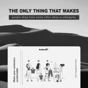
The only thing that makes people shop from some other shop is ambiguity. Provide a clear soft copy of the instructions to use the product and mention the steps to assemble the product (if required). Providing visual guides is known to be one of the best ways to make your customers feel comfortable browsing through the products you have listed.
Present clear call-to-actions
The Call-To-Action or CTA is the step that the visitor needs to follow after choosing the products to purchase. No, it is not the last thing to consider. Right when the customer lands on the product pages, they look for the CTA in order to decide the products to be purchased. The CTAs such as ‘Proceed to Checkout’ or ‘Add to Cart’ must not only be provided but also be clearly visible to the visitors.
Also, be sure that these CTAs are a button, upon which the customers can click and land onto the desired page. It is studied that online shoppers are bound to search for buttons when it comes to ecommerce websites or stores. Anything other than a button, including links and other non-standard ways may question the authenticity of the entire website. The call to action buttons must, like the product pricing, stand out of the box and highlighted unlike every other information on the product page.
Be transparent with the product pricing
The product pricing in the product pages must be uncovered. It is always, we repeat that Always be transparent. Make sure that you are not making your visitors hunting for the prices of the products they intend to purchase. It is understood without saying that no one is purchasing and investing their money without knowing how much is to be invested in the purchasing. Therefore it is always suggested to place the pricing of the product of the top side of the product page. Usually, the ideal place for product pricing is somewhere around the product title or the ‘Add to Cart’ button.
No matter how amazing your products are, the visitors are not becoming your customers until they know the prices of those products. Hence, it becomes a fair deal to be transparent with the pricing on the product page as much as possible. Remember that even if the product price is too expensive, you should be transparent about the price in the most valued place – near the product title or the ‘Add to Cart’ button. The reason we suggest these two locations is that these are the regions that grab most of the visitors’ attention, making it easy for them to spot the price of the product. In order to highlight the product pricing, you can consider using larger fonts, contrasting colors, and highlights (in case of discounts or variations in the actual price). If the product pricing is not transparent on your product pages, you might really want to reconsider its design.
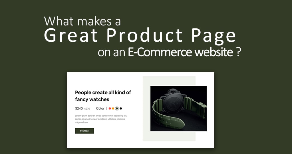
Use clear, non-pixelated product images
![]()
According to HubSpot, about 94% of views are increased when content is accompanied with the right images. The importance of this stat significantly increases when it comes to product images in an ecommerce website/ store. The images on the product pages are a way to visually communicate the product details to the visitors. Therefore, experts consider it a best practice to use high definition images on the product pages that does not get pixelated when zoomed in. Uploading multiple product images, clicked from different angles adds a cherry on the cake for the visitors to become your customers as well as for customers to come back to your store every time they shop online.
Quality product images can greatly impact the enhancement of the UX, sales, and conversion rates. You should also be mindful of the download time of the product images as not every visitor is having a super-fast internet connection and a slow downtime can cost you a visitor or even more! You can, and in fact, must ask your happy customers to share the real-time images of the products and their reviews on the quality of the products. This would help you gain social proof for the products you sell online that can inspire the new visitors to purchase from you. Make sure to make these social proofs easily visible to the online shoppers landing on your product pages.
Give a specific product title and detailed overview
Apart from the high definition images, your product pages need sufficient product information for answering the visitors’ possible queries regarding the products. The product information comprises product title, product price, CTA, product features, and available customization options. Usually, all this information must be above the fold, which is practically not a possible solution. However, some brands do make this true by using colors, icons, and fonts instead of heavy content in the product descriptions. No matter what side you choose to be on, you should make sure that you are diminishing the anxieties of a first-time visitor to your online store as well as instill trust within every visitor and customer landing on the product pages of your ecommerce store.
Another tip to make great product pages is to use unique product descriptions that are both optimized for your product title as well as your brand. You can consider taking a look at your competitors’ product pages that use the same or nearly similar keywords for the products you sell. By doing so, you will have an aim to create a better version of the product descriptions than your competitors, giving you a competitive edge. You can also make long product descriptions more interesting to read by using bulletin points or graphics.
Help visitors make an informed buying decision
Be it, first-time visitors, be it, regular visitors, the purpose of landing on your product page is to find something they have been looking forward to purchasing. And when they come to your store to purchase something, they would probably be unaware of the number of products you have in store that can serve their purpose. Therefore, as an online seller, it is your role to let your to-be customers take an informed decision. For this, you can consider providing them with all the relevant options they have with detailed comparison, by which they can choose the one that fits all their requirements.
For example, one of the top ecommerce marketplace players, Amazon shows comparison charts of the product that the customers are viewing and the similar products that can be considered instead of the one they chose. Here, you can also consider upselling by showing them products that cost more, with obviously better features, than the one they chose. However, you need to be considerate of the budget of your customers can upsell products that revolve around their budget in order to convince them to look for something better.
Conclusion
Product Pages have the power to make or break your ecommerce website. As an online seller, it is completely up to you how unique and amazing you provide UX to your customers. By using or at least experimenting with these tips, you can easily round up to the ones that work best for you to lead visitors to become your customers.