


Did you know that a person is more likely to buy two pieces of Broccoli when it is fresh and pure in green color but won’t buy if it is rotten.
Perception matters…
With the advent of ecommerce, consumers are even more inclined to search for and buy products and services online. Many organizations and individuals are selling different products and services online to the point where the competition has gotten fierce and is even getting fiercer as everyone, through their ecommerce sites, fight for the attention of customers.
This makes the design of your ecommerce site a very crucial factor for success. It is something that has turned out to be exceptionally delicate and requires special attention, so you can accomplish the best outcome.
According to Tammy Everts, a senior researcher and evangelist at SOASTA, there are three common ecommerce website design mistakes to avoid. Check out them, and if your website is a victim, make the required corrections.
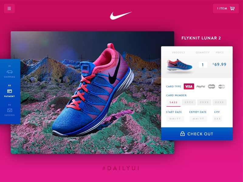
Lack of Quality Image with Detail
HD images with a good eye for detail are the driving force for any ecommerce website. Hire a professional photographer will ensure to pick quality images for your ecommerce website with better consideration over product background, lightning, and after photo editing. It makes up of 30% work on an ecommerce website. Another good design practice is to provide a magnifying feature inside your product page so that customers can view an enlarge canvas for tinier details much easier.
It’s important not to display small images or images that have poor resolution. If possible, place images captured by professionals with a decent camera and extraordinary lighting so that people enjoy looking at them.

In a study published in October 2013, two researchers found that when people looked at products, too many pictures can overwhelm the customer, so much so that he’d put off the purchase indefinitely. When there are too many pictures, people tend to skim and skip. They simply don’t appreciate the visual variety.
The researchers found that customers will need to slow down and consider choices more cautiously and attentively when they’re presented in writing form.
Complicated or Lengthy Checkout Page
A study conducted by the Baymard Institute has found that a long or complicated checkout process is the second most common reason for users to drop out. Confusing navigation and a lengthy checkout process will only give customers more opportunities to leave your site before actually making a purchase.
An important rule to remember for any ecommerce website is to make your Checkout page as seamless as possible, because it’s the target page which process payment and turn around business for the website. Making it unnecessarily difficult to reach it is a bad design practice. For a rule of thumb, always make sure to provide 3 steps for buying any product, which comprises, product selection, cart, and additional information, check out.
Product Alignment – Horizontal or Vertical?
We perceive things differently when they’re laid out vertically and when they’re laid out horizontally.
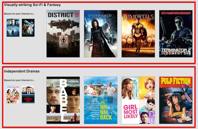
In a study currently under review, experts have discovered that viewing a collection of products horizontally prompts more perceived variety than when viewing a choice vertically. That implies that if you arrange your items from left to right, then customers will believe that there’s a more noteworthy variety of products than when you sort them up to down.
What’s more, what do consumers see when items are placed vertically? They will feel that a product in another row is of a very surprising category.
The study demonstrates that when products are sorted horizontally, then customers willingly want to see the variety and want to purchase more than one item. When items are arranged vertically, they don’t want to see variety, thus choose just one item.
For example, Netflix has realized this. So many same kinds of movies would be arranged in a row, while an entirely different category will be below with its own dozen films.
Conclusion
Ecommerce designing is the overwhelmingly sensitive part which must be taken quite seriously. If you were careless in any way, whether technologically or aesthetically, you will surely lose your spot for becoming the next big thing, like Amazon or Alibaba.
Putting up with your website according to the standard practices is the only option and responsibility for a designer to go ahead and work his magic.
It’s likewise important to take note that there are no magic numbers here. What trick works for one business may not work for another. So it’s everything the more significant to test your way into making your item showcase the most convincing and appealing that it can be.
Get started with Builderfly and start designing your stunning online ecommerce websites. Choose from thousands of ready-made templates and give your customers the best shopping experience.
Click here to get started with your 14-days free trial: www.builderfly.com