


Your storefront looks great. You might have spent a lot of time modifying it and ensuring everything flows perfectly. But, without a call to action (CTA), your marketing messages are like shovels without handles. They may be pretty and well-designed, but they’re nearly unusable.
Visitors come to your ecommerce website looking for answers to their questions and solutions to their problems. Unfortunately, many marketers—even those in management positions—love to help people, but they don’t want to “sell them”.
Those afflicted with the idea that selling is somehow evil are prone to see the CTA button or message as a pushy sales tool—one they’re reluctant to use.
If this sounds like you, it’s time to change your tune.
Knowing how to use CTAs effectively is a skill essential to conversion rate optimization. Whether you’re not using CTAs enough or your CTAs aren’t as effective as they could be, this article will serve as an excellent primer you can review and discuss with your marketing staff.
We’ll begin by talking the seven actionable call-to-action examples which you can use to make your CTAs work better.
What is a call-to-action?
The call-to-action button (or other CTA link) on an ecommerce website is a prompt to take the next step toward becoming a new customer or repeat buyer. The CTA typically takes the form of a succinct ad copy coupled with a graphic that’s designed to get visitors to click a link (take an action) to move forward on the sales path.
Examples of CTAs are everywhere online, including Google Ads, free trial offers of SaaS products, landing page, Buy Now buttons, email campaigns with Find Out More click-throughs, and various prompts aimed at getting visitors to add products to a shopping cart.
Get ready for the deluge of conversions you’re about to experience.
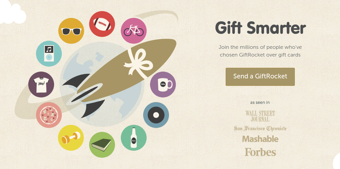
1. GiftRocket – ‘Send a GiftRocket’
Let’s face it – off-the-shelf greetings cards and gift certificates are pretty much the easiest ways to tell someone you care. However, GiftRocket manages to merge the two into a wonderful compelling package that can result in a perfect gift for the people you love.
Why this call to action works
This CTA is so useful because it doesn’t ask you to “Sign Up Now” or “Get Yours Free,” but lets you to “Send a GiftRocket,” a much more exciting and interesting way to send a gift.
This landing page features simple yet striking imagery along with active verbs and short sentences, resulting in a unified experience. Why should you send a gift card when you can Send a GiftRocket?
2. Amazon: Emphasizing security
It’s one of the easiest calls to action examples however it shows how you can give so many reasons for visitors to keep interested in your CTA.
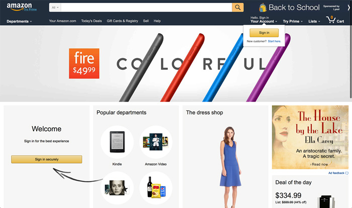
Since Amazon handles many credit card data of its users, they thought of emphasizing security in their main CTA. They use customer segmentation to get a good idea about their user’s doubts and need to address the one with the CTA. They also showcase the value in this way.
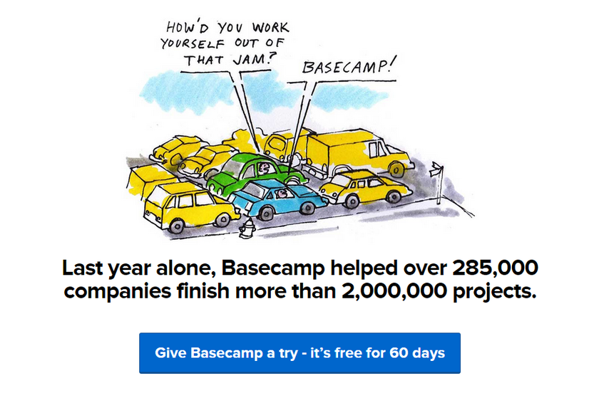
3. Basecamp – ‘Give Basecamp a Try’
Basecamp is designed about everything for project management with ease in mind. From the tone and style of its website copy to its minimal, approachable design, Basecamp tends to simplify life for project managers around the world.
Basecamp’s call to action is just another variation of a tried-and-true CTA – the free trial – yet features some effective and subtle, differences.
Why It Works
Basecamp’s CTA is effective because it simultaneously improves the risk-free nature of the free trial while utilizing casually persuasive language. “Give Basecamp a try” would attract more traffic than “start free trial”.
Indeed, the CTA’s diction almost suggests a blasé attitude – kind of like, “What will be the worst that could happen?” This is actually what Basecamp is trying to achieve because they’re very confident that users will try the product, they don’t want to make an aggressive pitch with a potentially confrontational CTA.
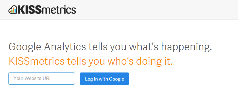
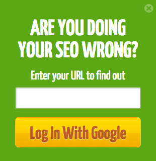
4. KISSmetrics – ‘Log In With Google’
A blog post about calls to action would not be complete without talking about KISSmetrics. Undoubtedly one of the simplest of all examples, this CTA from the KISSmetrics homepage is likewise one of the most adaptable.
Why It Works
Rather than launching into a detailed breakdown of KISSmetrics’ bells and whistles, the homepage simply says what the platform does.
However, what makes this CTA so convincing is that it requires as little info and effort from the user as possible – only a URL. The “Log In with Google” button tells users precisely what they can expect, and makes it strangely simple for them to begin. The phrasing of the explanatory text additionally serves to arouse users’ curiosity, and the mention of Google reinforces the prospects’ requirement for security – no mention of OAuth or some other verification technology essential.
5. QuickSprout
Nobody needs to be wrong. That is the reason a call-to-action button like QuickSprout’s slide-in CTA on their blog is so click-worthy. It asks the reader a question, “Are you doing your SEO wrong?” Well, am I? All we have to do is simply enter the URL to discover — seems simple enough. It’s a language like that that can truly entice visitors to click through.
Additionally, having the CTA slide in a mid-blog post is an extraordinary strategy for attracting readers before they bounce off the page. Generally, many blogs have CTAs at the very bottom of each blog post, but research shows most readers just get 60% of the way through an article.
6. Adobe: Upselling while keeping the hierarchy
There’s a huge amount of various ways you can engage your website visitors and ask them to buy or sign up. The issue is, the more strategies you use, the higher the possibility that you will complicate your site flow.
To get around that, you have to focus on the hierarchy of information on your website. And more significantly, the hierarchy of your CTAs. Adobe is a decent example of how you can have so many CTAs not competing with one other. When introducing their pricing for their Creative Cloud, they offer a basic ‘Buy’ option and furthermore use an upselling CTA also.
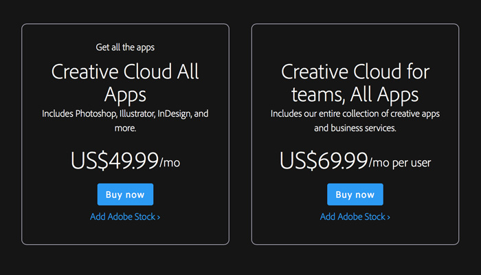
Why it works
This way, users move further down the funnel through the unmistakable ‘Buy’ CTA and find out about the stock option too.
7. Madewell
Madewell (owned by J.Crew) has consistently had a standout website design, taking what could be a typical ecommerce website to the next level. Their utilization of CTAs on their homepage is no exception.
When you initially land on the page, you’re welcomed with the headline “I’m Looking For …” followed by a category, like “Clothes That’ll Travel Anywhere.” The user can select between the two CTAs to either browse clothes that are useful for travel or be taken to the following type of clothing, where they can play once more.
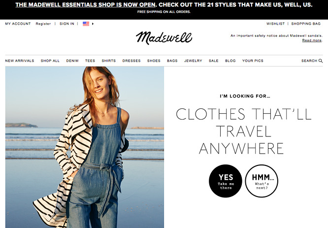
This gamification is an extraordinary way to make your site more interesting for users who go over it without having a particular idea of where they need to look.
Which is your favorite call-to-action examples
The best call to action phrases are clear yet explicit and create an urgency that drives the user to action. If you have an irresistible offer, your call to action should sell its value.
Simply consider the last call to action you clicked and why you did it. That is more likely a quite good example!