


How do you recognize a brand? By its logo, the tagline, the brand name, or its colors?
Bingo, if you said, all of the above!
Most people have an extremely cluttered inbox and for your brand to stand out, you’re going to have to combine eye-catching design with great email copy.
If you own an ecommerce business and use email as a marketing tool, then you need to reflect your brand’s personality in your emails. Your branding lies in the alignment of your text, the colors, the headers and footers, the typography and fonts you use, the way you write the copy, everything! Consistency is the key to creating a brand identity.
Here are some email marketing best practices from 6 popular ecommerce brands.
Typography and Vibrant Colors
Utilizing unique typography and colors will enable your brand to grab eyeballs. Use vibrant colors and creative fonts but ensure that it goes well with your brand’s personality. Once you choose the appropriate typefaces, use them consistently in all the emails you send.
Here are some tools and apps that make it easy:
- Tiff: Tiff is a web app that lets you compare how different typefaces look and shows the differences between different fonts. This helps you in choosing the right font for your emails.
- Fontroid: If you want to add a font of your own, then Fontroid is the right Android app for you. This app lets you add your own handwritten fonts, which can be further added to your emails in the form of images.
- Fontest: This is a typography tool that lets you add fonts of your choice and preview them before adding it to your images or text.
Though these apps and tools let you experiment with your fonts and typefaces, make sure you add proper fallbacks to these fonts.
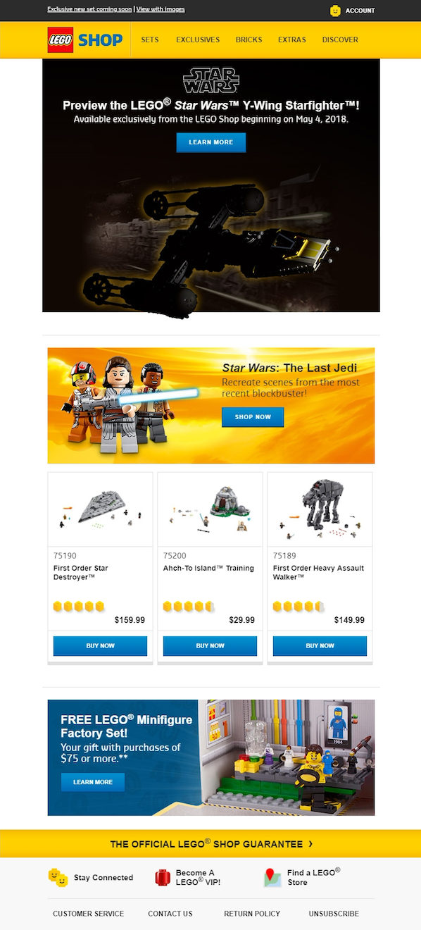
The brand Lego creates brilliant emails with stylish fonts and vibrant colors. The multi-colored images and typography reflect the youthfulness of the brand and maintain the brand’s identity.
Brand Story
Introducing your brand to those who subscribe to your email list is a great way of welcoming them and letting them know you better. The story of your brand’s journey will help create a great relationship between you and your subscribers.
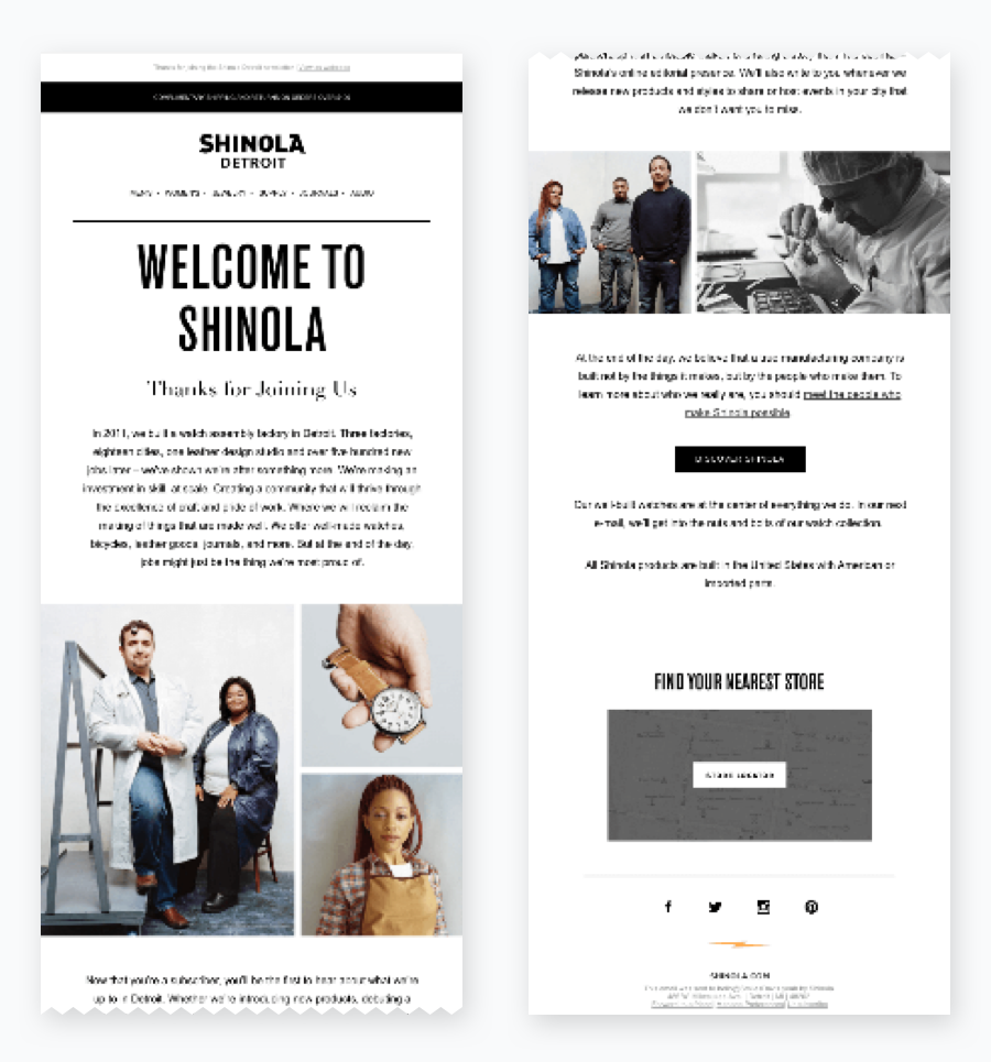
Take a look at this email from Shinola that narrates its brand story in its welcome email. With real images and a detailed story, the email builds trust among its readers.
‘Twin-look’ for Landing Pages and Emails
Creating perfect landing pages for your emails is an essential part of a marketing email as well. Creating synergistic landing pages for your emails establishes a consistent brand experience for your subscribers.
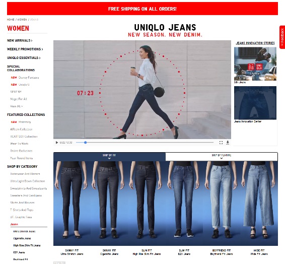
Take a look at Uniqlo’s email example and its corresponding landing page that has the same design layout and images. The “twin-look” design makes it easy for the subscribers to recognize and connect with the brand.
Logo and Brand Colors
The logo or name of your brand is the first thing that readers should see when they open your email in their inbox. Your subscribers will recognize your brand first and foremost from your logo. That’s why to include your logo at the top of the email.
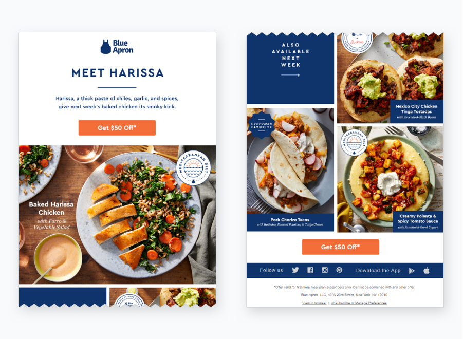
Take a look at this example from Blue Apron. The brand logo is placed right at the top, in a way that it is the first thing that catches the subscribers’ attention and its brand color is maintained throughout the email, for the subscribers to identify and connect easily.
Strong CTAs
Your emails should be able to persuade subscribers to click-through and take some action. For this, you need to have strong and prominent calls-to-action in your email.
Highlight the CTAs using the right colors, most preferably the brand colors to make them evident.
Colors influence the emotions of the readers. Choose the perfect color scheme that best suits your message and branding and make your CTAs more persuasive.
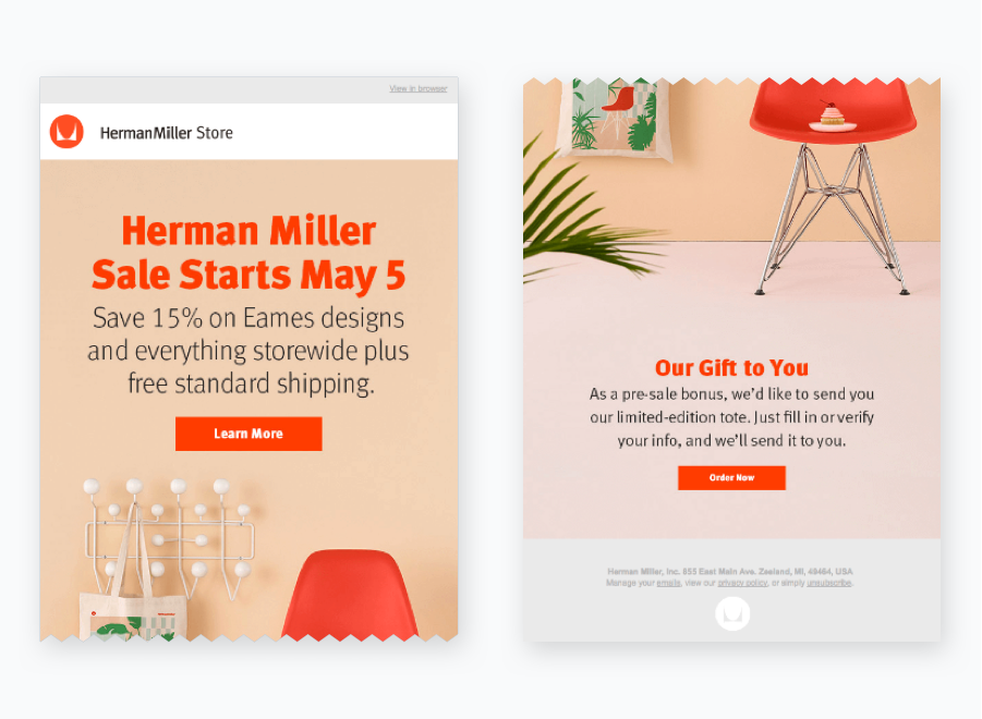
Check out this email from HermanMiller Store. They utilize its main color for the CTA. The entire email has a light background and the CTA button stands out.
Brand Visibility Across Mediums
Being present on all well-known social media channels is beneficial for building your brand identity. So add links to your various social media platforms in every email.
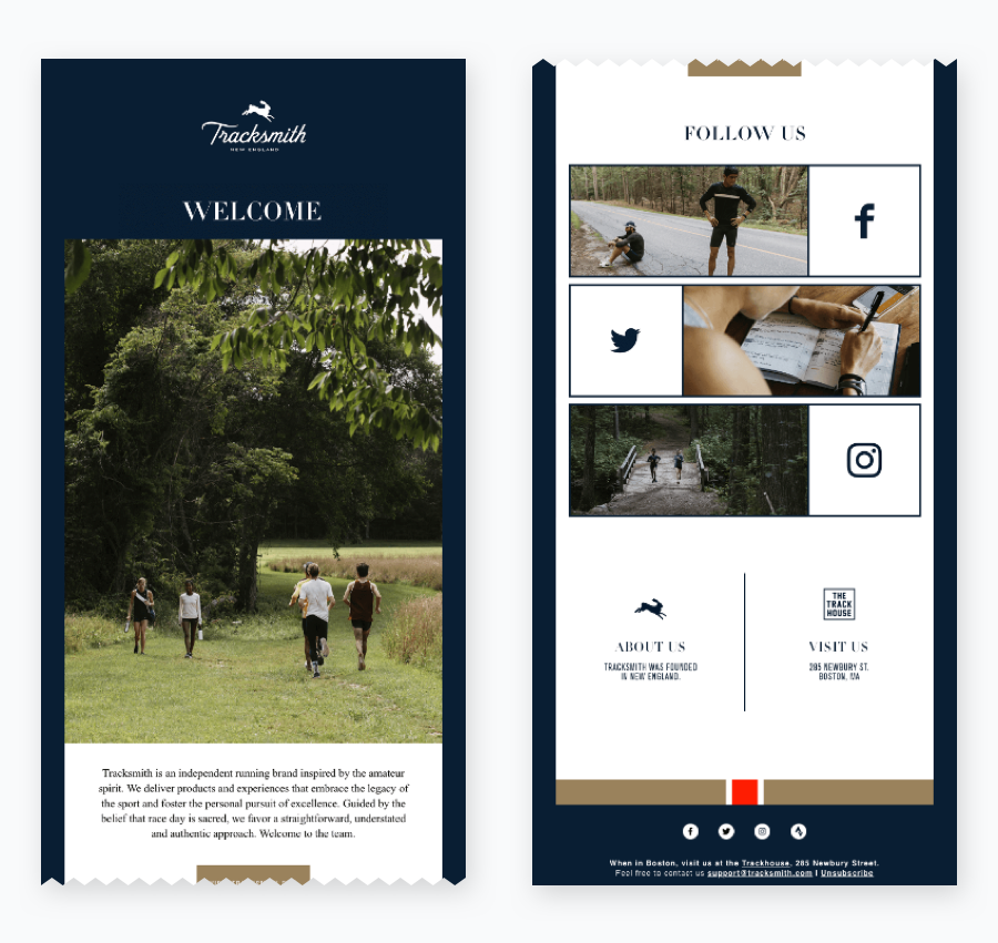
The brand Tracksmith has given links to its Facebook account in their welcome emails, Twitter and Instagram page. This way, they are making it easy for their subscribers to find them on these channels and connect with them more closely.
Wrapping up
Many marketers tend to overlook the advantages of maintaining a unique brand personality in their email or newsletter design. Hopefully, this article clarifies how you can use your brand personality to better connect with your subscribers by fostering a stronger email brand personality and in turn a stronger brand in general.
If you need more inspiration, just check your inbox and find the brands that resonate the most with you!